INFO

Format:
Brand Identity System
Scope of Work:
Design
Client:
-
Team:
-
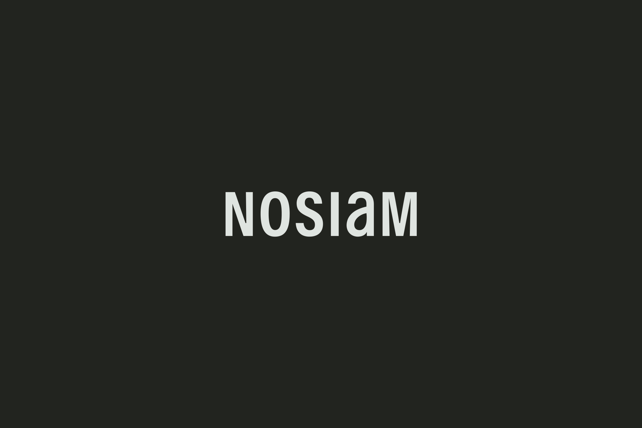
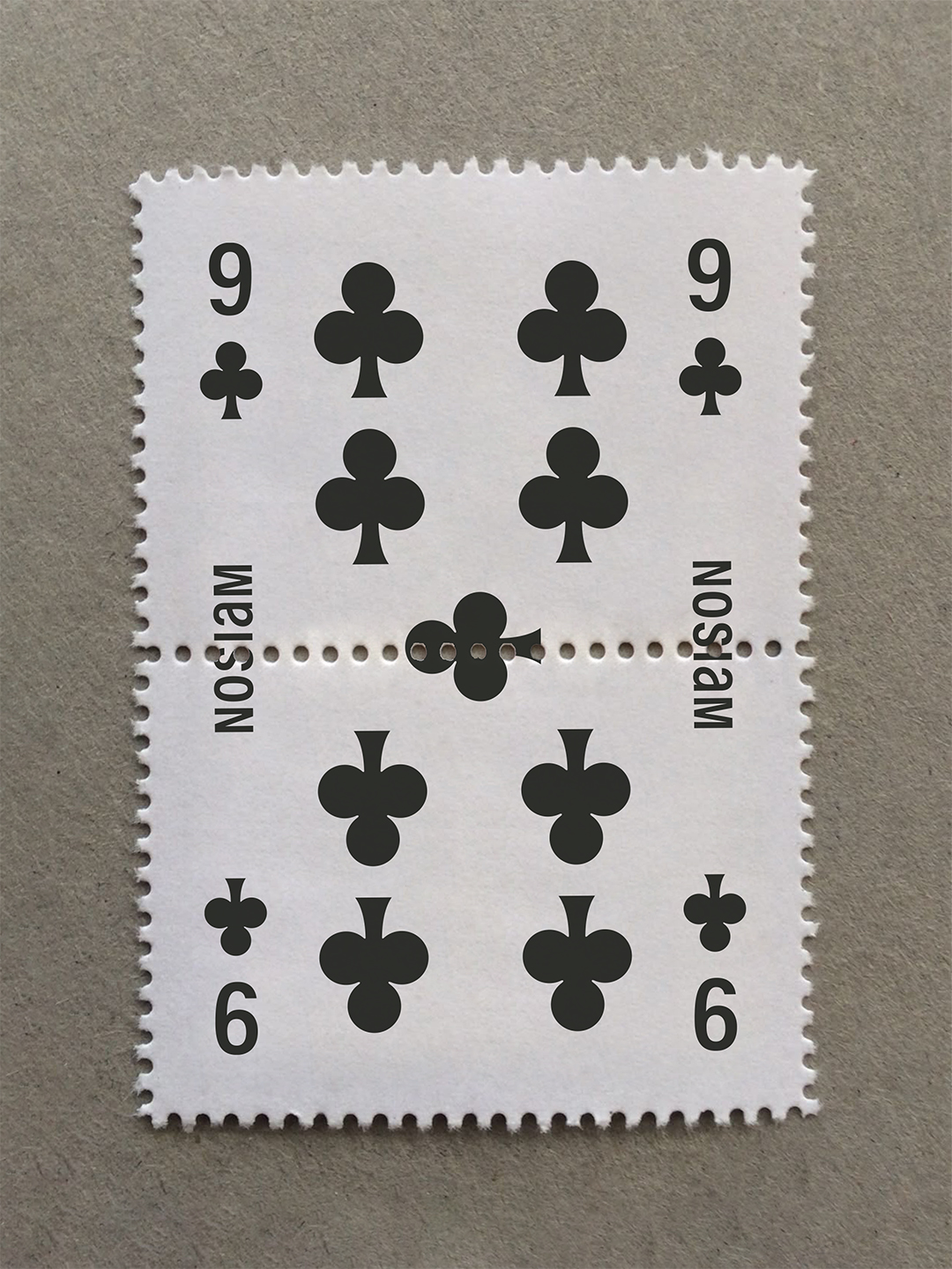
Just as ‘Maison’ is read in reverse, NOSIAM reframes the familiar, composing it anew through a unique sense of balance.
The form it presents becomes a symbol, completed through each perspective.
‘Maison’을 거꾸로 읽은 이름처럼, 노시암은 익숙해진 무언가를 뒤집어 보고, 특별한 균형 위에서 새로운 모습으로 구성한다.
나아가 그 형상은 누군가의 시선에서 고유한 표상으로 완성된다.
Brand Philosophy
"Out of impression, into emotion — A Singular form, shaped by you"
NOSIAM’s philosophy follows a flow of three stages: perception, emotion, and form.
When a subtle but powerful impression is interpreted through one’s emotions,
it takes shape as a unique form. Within this flow,
NOSIAM offers a blank that encourages interpretation and immersion —
an easy beginning for a creative experience.
“감각의 출구에서 감정의 입구로 — 당신으로 도착하는 고유한 형상”
노시암의 철학은 감각, 감정, 그리고 형상이라는 세 단계의 흐름을 따른다.
흐릿하고 강렬한 감각이 개인의 감정을 통해 해석될 때, 마침내 고유한 형상으로 완성된다.
노시암은 이 흐름 안에서 해석과 몰입을 돕는 여백을 마련하며, 그 여백은 창의적인 경험이 시작되는 자리로 쓰인다.

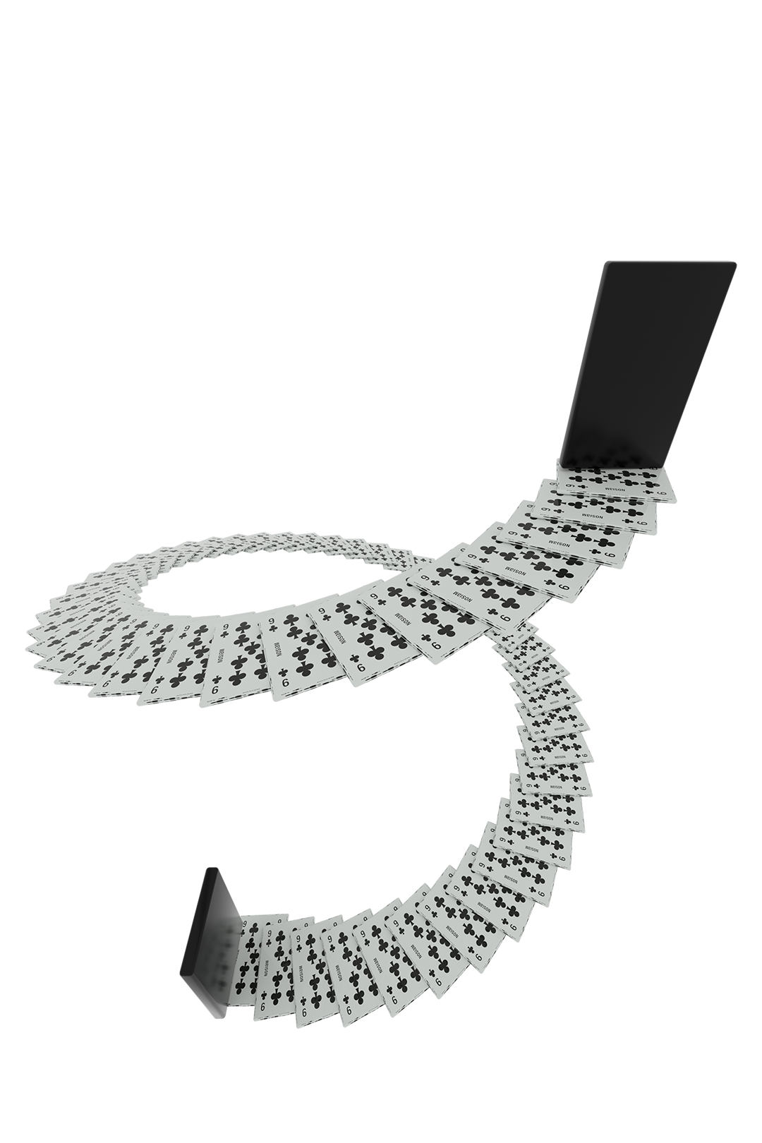
Logotype

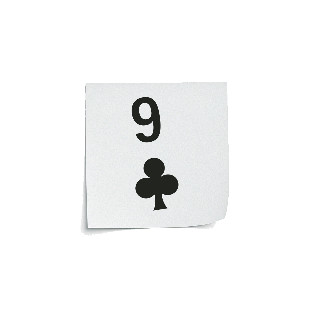
Symbol
The logotype features a lowercase ‘a’ crossing over an uppercase sans-serif shape,
expressing the brand’s pursuit of harmonious change and a unique sense of balance.
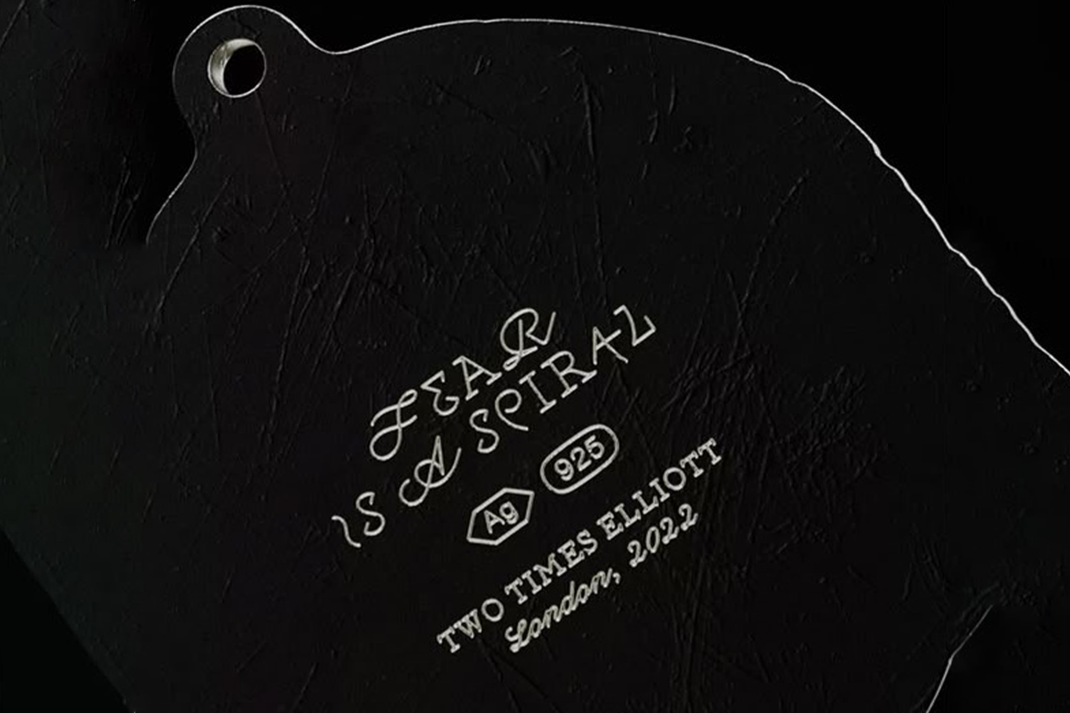
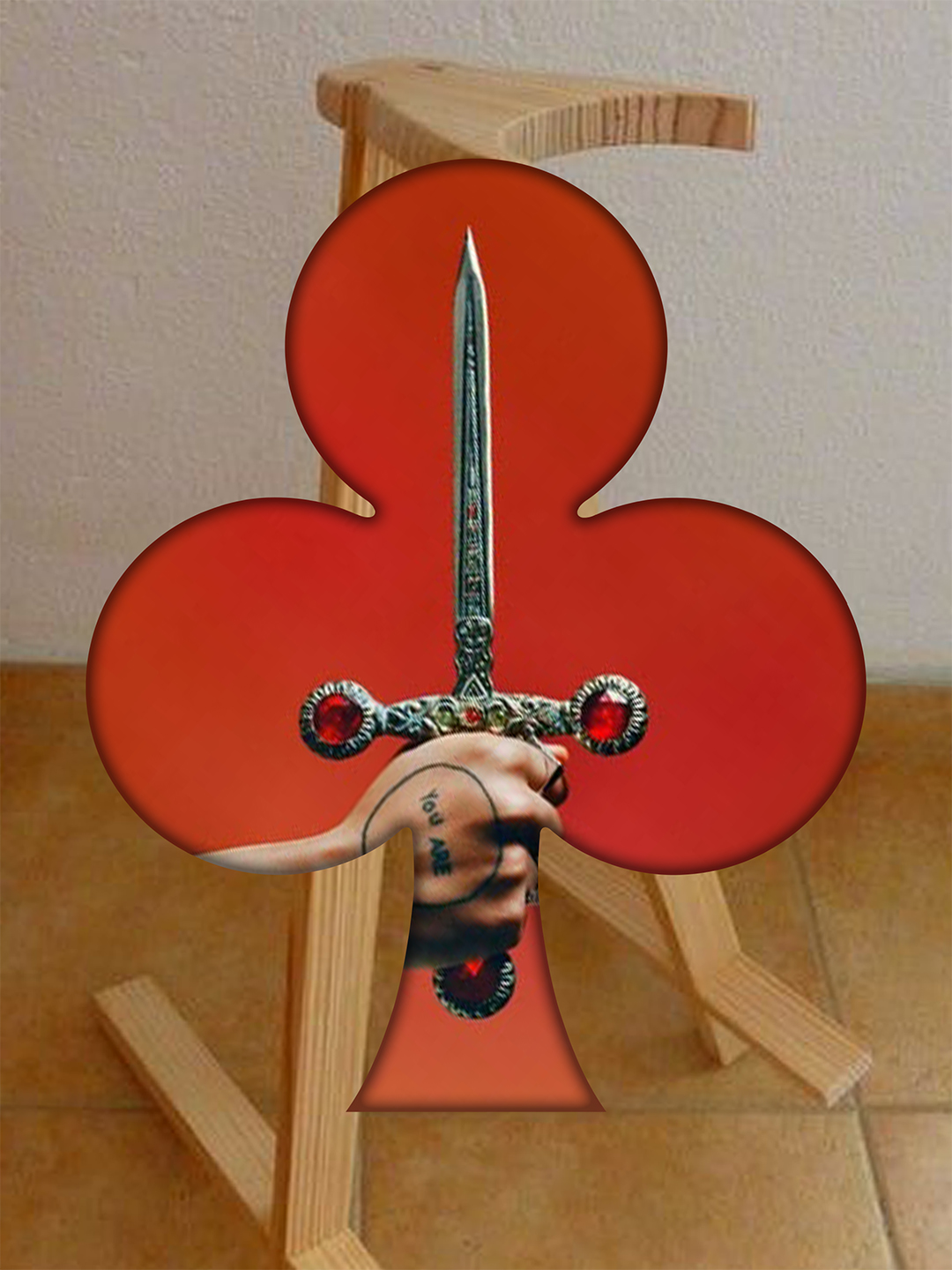
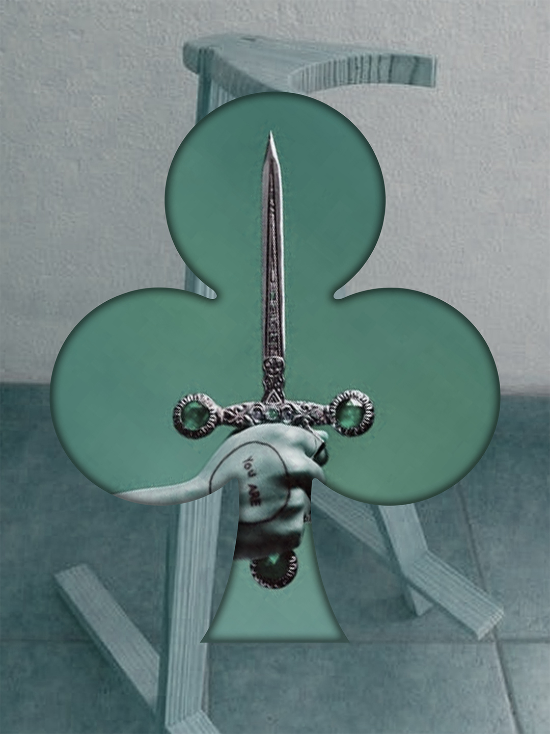
It is paired with a symbol inspired by the 9 of Clubs from a deck of playing cards.
The clover shape represents balance and harmony, while the number 9 marks the end of one cycle and the beginning of another.
Together, they reflect how each person’s perception is shaped in their own way, and the potential that comes from it.
로고타입은 산세리프 형태의 대문자 구조 안에 소문자 a를 교차 배치한 구성으로, 브랜드가 지향하는 조화로운 변주와 색다른 균형감을 표현한다.
동일한 위계로 사용되는 심볼은 트럼프 카드의 클로버 9에서 착안한 것으로, 클로버 문양은 균형과 조화를 상징한다.
숫자 9는 하나의 주기가 완성되고 새로운 시작을 알리는 숫자로서, 감각의 해석이 저마다의 방식으로 완성되는 과정과 잠재성을 상징한다.

Graphic Motif - Trump Suits

Color palette
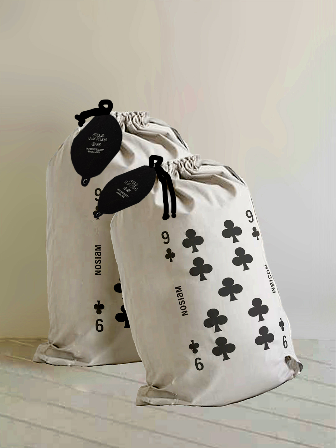
Package
Packaging Inserts
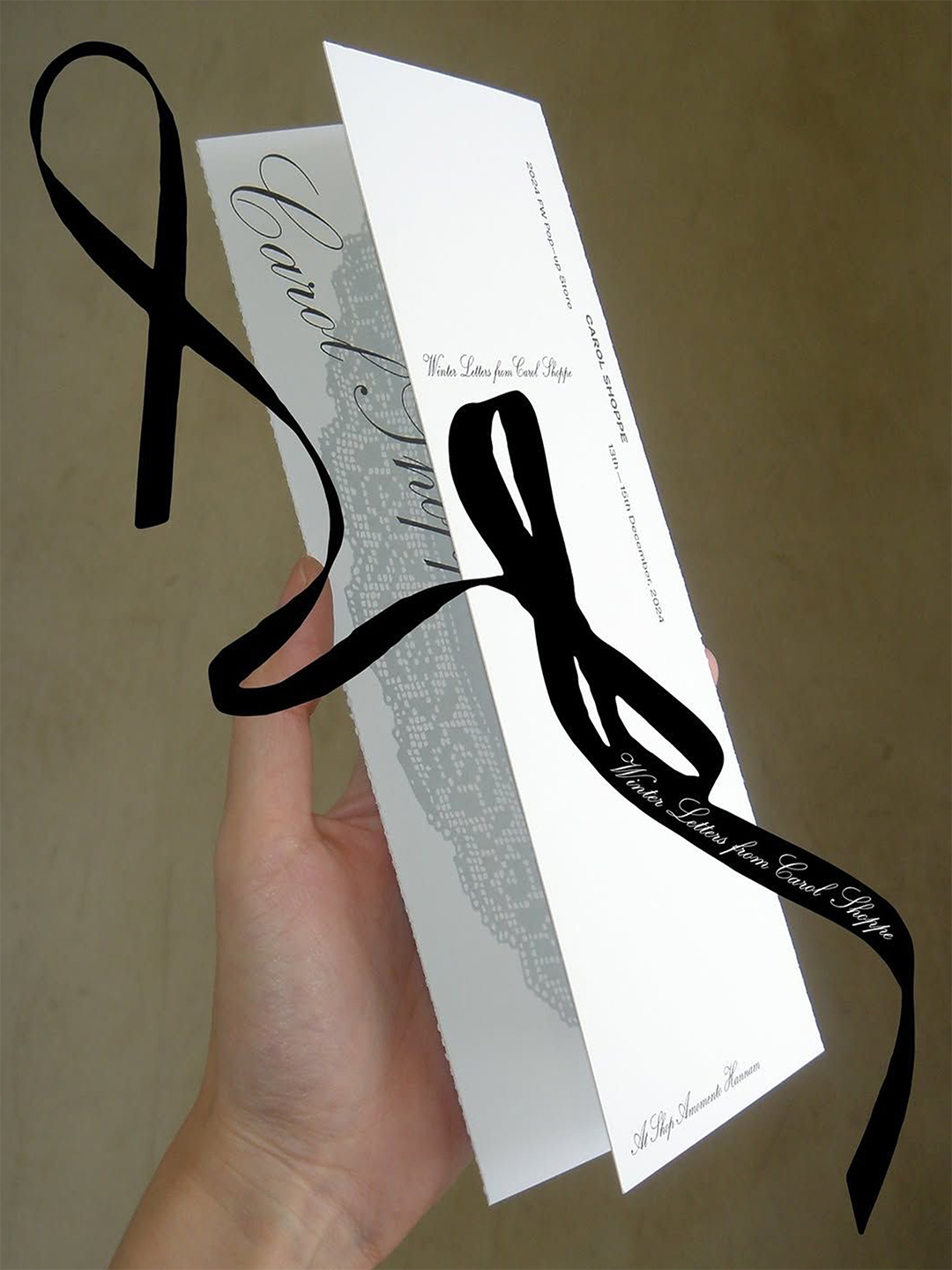
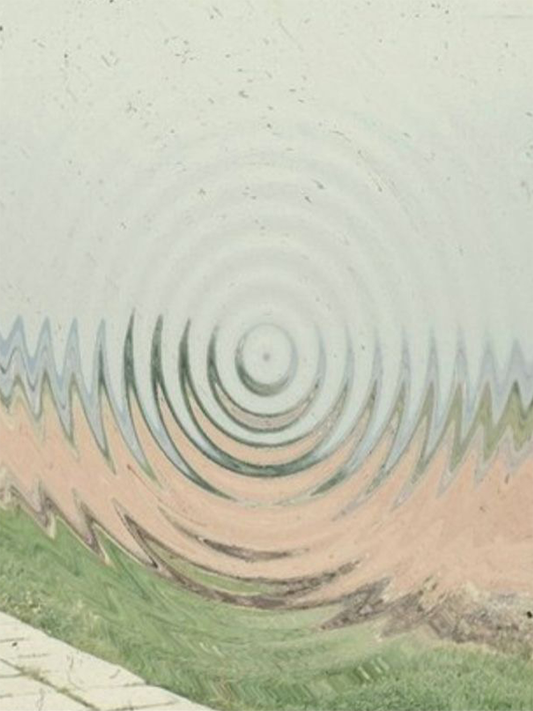
NOSIAM’s visual system does not operate rigidly.
Except for the essential brand signatures, all visuals are freely composed to suit the needs of each project.
The simple color palette is not intended to carry specific meanings,
but rather to serve quietly like a background.
노시암의 비주얼 시스템은 엄격하게 작동하지 않는다.
필수적인 브랜드 시그니처를 제외한 모든 비주얼은 각 프로젝트에 최적화된 형태로 자유롭게 구성된다.
단조로운 컬러 팔레트 또한 특정한 성질을 의도하기보다, 배경처럼 조용히 존재하도록 사용된다.


© 2025. Mir Kim All Rights Reserved.